

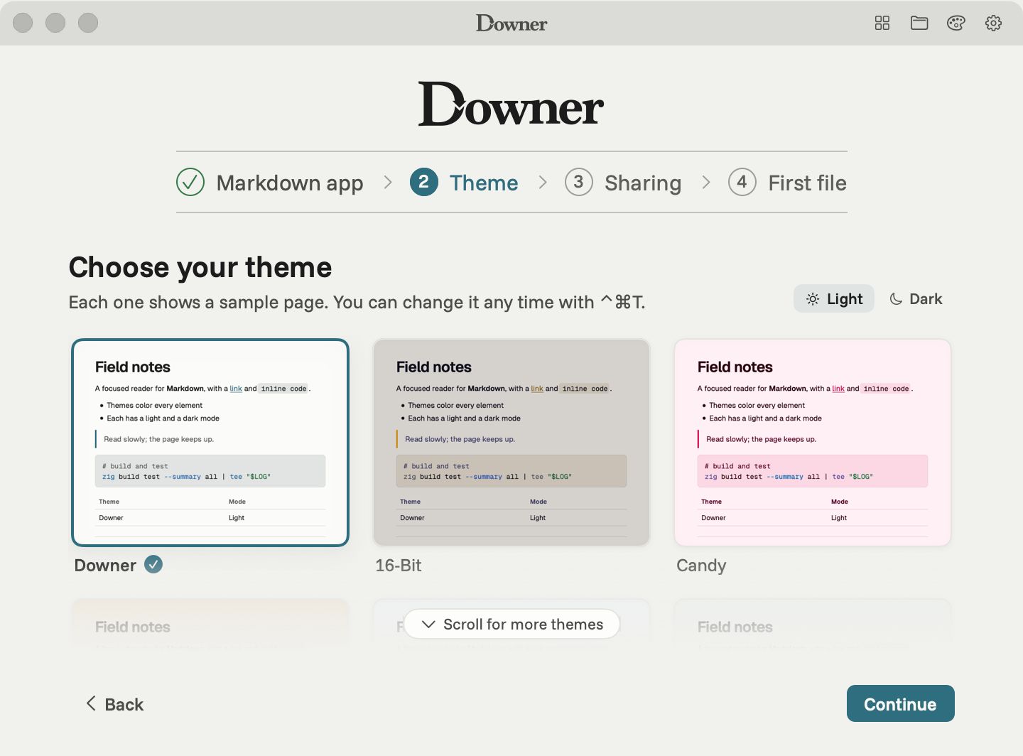
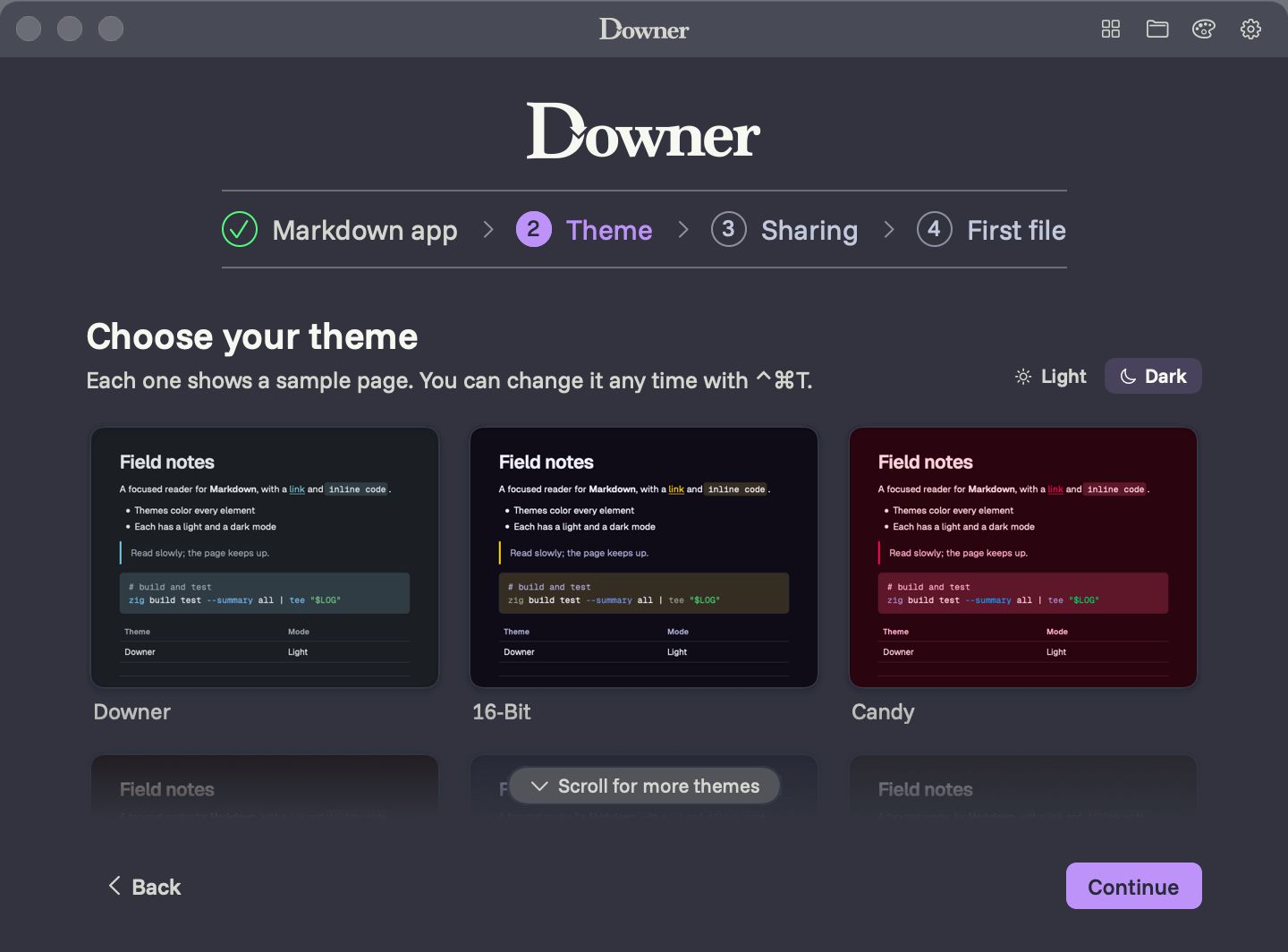
A reader you spend hours in should look the way you like. Downer comes with 15 theme families, and each one has a light and a dark mode designed together, so switching at sunset doesn’t change the character of the page.
The themes
Downer (Newsprint in light, Slate in dark), 16-Bit, Candy, Cartridge, Catppuccin, Dot Matrix, Dracula, Gremlin, Gruvbox, Marshmallow, Periwinkle, Signal, Terminal, Vibe and Videotape.
Every theme is held to the same standard for legibility, so table lines, code backgrounds, quotes and highlights stay visible and text on them stays easy to read, whichever you pick.
The Theme Library
Press ⌃⌘T, or click the palette in the title bar, and the Theme Library slides up with every theme drawn as a small sample page. Click one, or move through them with the arrow keys, and the document changes straight away. Its Light and Dark switch shows every thumbnail in that mode.
Diagrams and math follow along
Mermaid diagrams, equations and code colouring all take the theme’s colours, so a diagram in Dracula looks like it belongs in Dracula.
Three kinds of font
Choose fonts separately for:
- the page: sans, serif or monospaced
- code: any monospaced face
- the app’s menus and labels: any face
There are 30 font families bundled with Downer, plus the fonts that come with your Mac. Every bundled face has a real regular and bold, and faces are matched so each reads at about the same size. ⌘+ and ⌘− change the text size, ⌘0 resets it, and ⇧⌘T flips back to the previous page font.